

Mobile websites
Mobile sites are websites designed specifically for mobile devices. Such a site is different from the full version and has a separate URL. They use features and content that will be mobile-friendly. These are often a fraction of the features that are available for the full computer version. Mobile sites are sometimes confused with adaptive sites. Mobile sites and adaptive sites both ensure that they are easy to display and use on mobile devices. Mobile sites are built specifically for mobile devices, while adaptive sites can adapt to different screen sizes on any device.?
Web Applications
Web applications are online applications that can be accessed and used through a browser without downloading to a device.
Web applications often have more complex structure and functionality than regular websites. They differ from regular applications in that they can be used through a web browser, so there is no need to download the application to your device
Desktop Sites
Desktop websites are websites specifically designed and optimised for desktop computers, providing a complete and comprehensive user experience. They can be adaptive or non-adaptive for mobile devices.
Websites with Adaptive design
Adaptive design uses the same website layout for computers and for mobile devices. Because web page elements are "responsive" they adjust to the screen on which they are viewed.
Adaptive websites use CSS responsive design queries, but have JavaScript-based enhancements to change the HTML markup of the website based on the capabilities of the device. This is known as "progressive enhancement." This design style does not require multiple designs - only layout templates stored in one place.
This design style treats all user interfaces (UIs) as a single entity. UI design and content are easily adaptable, and you only need to create a single layout design.
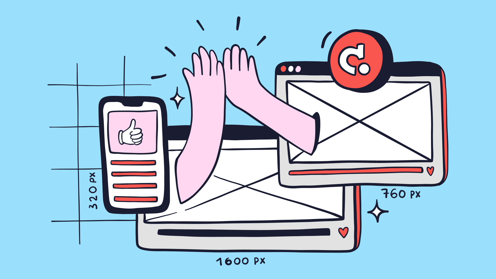
It is common to develop six types of designs for the most common screen sizes-320, 480, 760, 960, 1200, and 1600 pixels is standard practice for designers.
Adaptive design enables designers to create customised solutions. This ensures that the interface displays optimally on different screen sizes.
Sites with responsive design
With responsive design, content is displayed based on the available space on the page. Responsive design responds to changes in browser width and reposition elements to adjust to the dimensions. The content will dynamically move to fit optimally in the browser window.
This design is easy to use. The same content can be displayed in a three-column format on a computer, a single-column format on a mobile device, and a two-column format on a tablet. However, in practice, many responsive sites are not fully adaptive and are not 100% consistent in features or content.
Adaptive or responsive design?
It's quite a tough choice whether to go for adaptive or responsive website design. Consider different aspects to choose the best option. In doing so, it is important to consider the needs of your business specifically.
1. Difficulty
Understandably, creating the different layouts required to implement responsive web design is a more extensive task. You need to create multiple variations for different devices so that the site displays on any screen. This means that responsive web design is easier to implement. However, you need to keep one nuance in mind.
The single layout that is used for responsive design also has its own challenges. Designers and developers need to pay proper attention to CSS performance and ensure high quality in organisational aspects to achieve a flawless design that fits all screen sizes at once.
2. Layout
The main difference lies in the number of layouts required for adaptive design. While a responsive website adjusts the optimal version according to the screen size of the visitor viewing the site, an adaptive website may have multiple layouts for different devices(usually 6 versions: 320 pixels, 480 pixels, 760 pixels, 960 pixels, 1200 pixels and 1600 pixels).
Another difference is the way the layout is defined. Ready-made layout templates are used for each type of device to provide a user-friendly experience. Responsive web design uses the browser window to determine the proper width and height of the viewpoint. Adaptive design defines the layout on the backend.
3. Load times
Users are becoming more impatient and selective. They may simply close a page if it takes longer than a couple of seconds to load. Therefore, it is important to pay attention to the mobile responsiveness of the site. Bounce rates increase if a page takes longer than 2 seconds to load. Adaptive design uses special resources for each screen size, the loading time of such websites is better than those based on responsive design. Simply put: adaptive design loads websites faster because it uses optimised resources for each screen size.
There are a number of solutions for responsive design, but they have limitations. For example, graphic content can be optimised with embedded static and dynamic images.
It can be concluded that websites with responsive design load faster. You can check the loading time using site audit tools.
4. SEO friendliness
Google favours adaptive design. According to search engine guidelines, adaptive websites have higher search engine rankings.
Responsive design has a significant disadvantage when it comes to search engine optimisation. Slow loading pages of responsive websites have a direct impact on bounce rates. This negatively affects SEO because an increase in bounce rates leads to a negative impact on user intent. This aspect has a crucial impact on search engine rankings. It is common for responsive websites to use the same URL on all devices. This too has an impact on SEO performance.
5. Flexibility
Adaptive web design seems to be more flexible because it uses special layouts for different screen sizes. But this type of design is vulnerable to the ever-changing market of modern gadgets. With the release of a new model of phone, tablet or computer, there will be a risk that ready-made layouts will not be enough to provide a quality user interface.
Responsive web design is not limited by screen size, even if some new device is coming to the market. Its layout can be adapted to any size. However, responsive design has its disadvantages. Sometimes you have to compromise on the functionality and appearance of the site to make it fit different screen sizes. Because of this, some features and elements may be cut down or may not display optimally on some devices, which can negatively impact the user experience.
Who is adaptive design suitable for?
Adaptive design is suitable for:
- Companies that build complex websites and need a high-quality mobile version
- Service and retail businesses whose websites contain a lot of images and text.
- Businesses that need fast-loading websites to improve competitiveness and UX.
- Websites that frequently tweak different aspects such as service coverage, contact information, etc.
- Small or medium-sized companies that would like to have a mobile-friendly, uncluttered website without a complex structure.
- A new online business that has just entered the market - a brand new responsive website will come in handy for a quick start.
- Projects that would like to have an optimised advertising background and spend less time integrating ads.
- Companies that appreciate all the pros of adaptive web design (single URL, SEO convenience, etc.).
Mistakes in adaptive design
You can create a quality design by learning from your mistakes and developing observation, but some common mistakes can be avoided immediately. Therefore, we want to share the most common problems and mistakes in responsive design.
All eyes on the desktop version
The development of mobile design is quickly supplanting its desktop counterpart. Often, even design on mobile devices outperforms design variants made for computers. However, most platforms on the internet started out as desktop sites, with mobile versions coming later. This has led to many sites leaning towards the desktop version and mobile devices being seen as an add-on.
Designers need to start adapting to a mobile-centric approach to work, moving away from the habit of putting all resources into desktop versions. Better to focus on the potential of designing for mobile devices, and how much more impact it can have on the evolution of design thinking.
This means a shift in approach, based on designing for multiple screen sizes, away from the usual six sizes that are known as the most common, requiring specialised design. But it doesn't mean abandoning desktop design altogether.
Buttons that are too small
Anyone who has ever come across an app that has buttons that are too small to press accurately will agree that this is one of the most annoying design problems on mobile devices. It's very easy to miss tapping with your finger on the small screens of mobile devices. While desktop versions enjoy the benefit of precise mouse pointers, thumbs and fingers on small mobile screens often miss the target.
Sometimes when implementing responsive design for the purpose of optimisation and available space, clickable elements are grouped together or reduced in size when zoomed in on smaller screens. This can be uncomfortable for users and impair navigation. Developers should pay attention to how their approach to responsive design will affect buttons.
Having a separate URL for mobile devices
Using separate URLs for the computer and mobile versions of a website results in wasted design, wasting valuable time and worsening your search engine rankings. Using multiple URLs goes against SEO requirements and is often unnecessary.
In some cases, using multiple URLs allows developers to create lightweight versions of websites that work more efficiently on mobile devices, although this only applies if the desktop version is not suitable for use on mobile devices.
Put design before functionality
While it's important that a website looks good on both desktops and mobile devices, its primary purpose is to ensure that it works and is functional. Users who visit a visually beautiful website assume that an equal amount of effort has been put into its usefulness.
The same goes for the level of functionality between a desktop and mobile device. If a desktop site can't provide a good user experience on mobile devices, it may be better not to bother adapting for them at all. In that case, it's better to focus on building and optimising the site for desktop devices to give users the best experience on those platforms.
Go beyond developers' visions by testing in different niches and use effective prototypes to make sure the design matches its functionality.
Fail to calculate future spending
Development costs money, and often design decisions are made based on short-term financial considerations without thinking about the future.
While adaptive web design requires a higher initial investment due to the labour-intensive nature of its development, AWD maintenance costs usually remain stable later on.
Adaptive web design can lead to unforeseen costs. However, the benefit of improved user experience can offset these financial risks.
Conclusion
In this article, we looked at how responsive design improves user experience (UX) on different devices and resolutions. We discussed the benefits of responsive design for mobile websites, web apps, and desktop sites, as well as the differences between responsive and adaptive design. We also highlighted a few key factors to consider when implementing responsive design, including the challenges involved, layout features, load time optimisation and SEO.
Adaptive design offers many benefits that improve the overall performance of a website. It ensures accessibility across a variety of devices and resolutions, speeds up load times and improves the readability of content. By using consistent content and client-centric design principles, adaptive design improves user interaction and provides a flexible and scalable solution. It also enhances the user experience, which disposes users to further interact with the site.
In addition, adopting adaptive design can lead to increased revenue as it targets a wider audience and adapts to devices that are convenient for them. However, before using responsive design, it is crucial to identify the target audience and understand their specific needs. In addition, it is important to keep in mind the possible pitfalls of adaptive design, such as focusing solely on the desktop version, buttons that are too small, using separate URLs for mobile devices, prioritising design over functionality and failing to anticipate the necessary costs.
In conclusion, responsive design is an effective approach to improving UX and optimising websites for different devices. By considering the principles and best practices of responsive design, companies can deliver an exceptional user experience, increase engagement and be competitive in the marketplace.


