

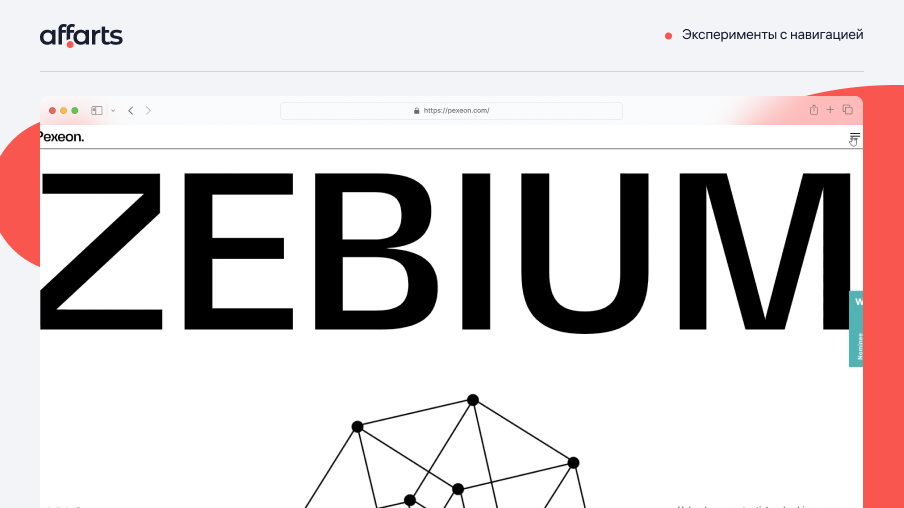
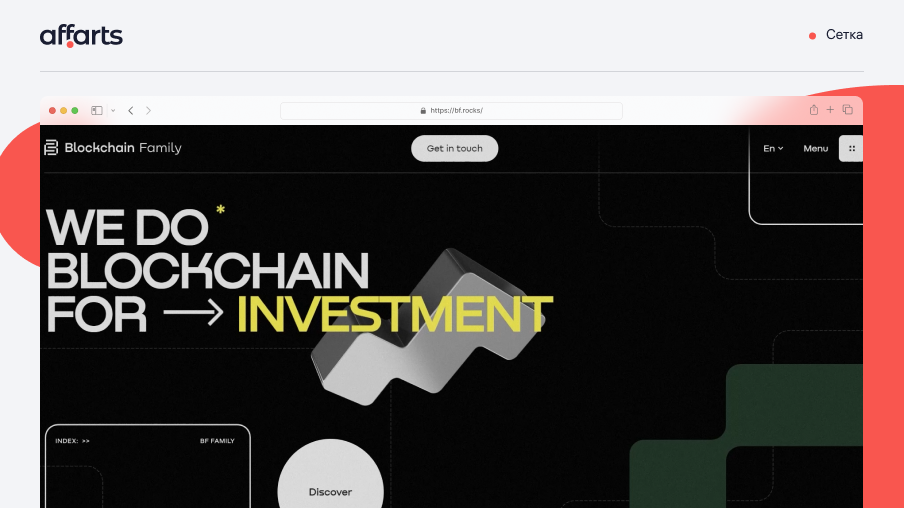
1. Experiments with navigation
In 2023, we're pushing the envelope and experimenting with navigation. Experimental navigation styles take a more creative approach. They attract the attention of users and direct interaction with the site.
However, it pays to be careful and intelligently compose the navigation of the site, so as not to confuse the user. Navigation should be intuitive. We recommend making the structure so that the user can get to the right section in a few clicks at the most.
What do we like? By experimenting with navigation, you can add uniqueness to your brand.
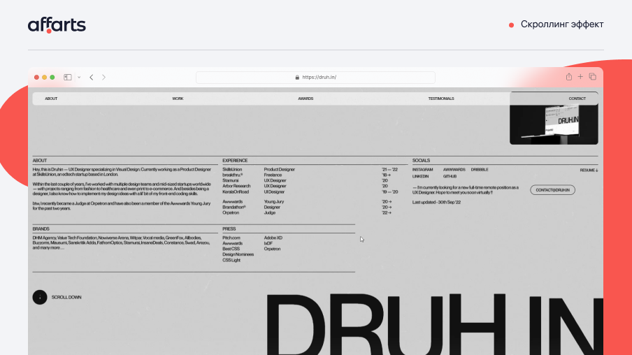
2. The scrolling effect
The more users scroll through the page, the more they explore your site, which will increase the opportunity for further action. There are several types of scrolling:
Parallax scrolling: This method is inspired by 2D vintage video games, where two layers move at different speeds, giving depth to the web page and making users scroll through it out of curiosity.
Horizontal scrolling: Scrolling up and down is great, but horizontal scrolling can add uniqueness. The important thing is to keep things clear and simple for the user, so you need to organize the content and navigation.
Long scrolling: It is now more common to see single-page sites where all the sections are arranged one by one. The user scrolls through screen after screen without being distracted by link clicks.
What do we like? The scrolling effect adds motion to the site, which will attract the attention of users. They can scroll through the page with interest to see what happens next.
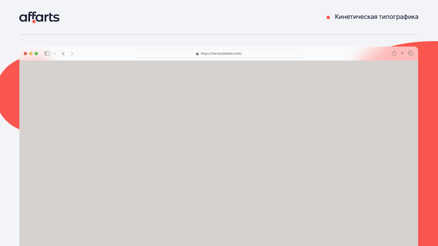
3. Kinetic typography
Kinetic typography, also known as moving text. This is an animation technique that became popular in the 1960s. Feature films began to use animated opening credits. However, in our time, this method does not lose relevance and is actively used.
Unlike static text, the kinetic typography animation is more capable of attracting attention. Manipulating the text and transforming it with the movement, you can achieve a variety of effects. With kinetic typography, you can put accents where you need them, convey emotions and evoke ideas, as well as turn a simple text into a powerful message. The only limitation is your imagination.
What do we like? One of the best things about modern kinetic typography is that it's more accessible than ever to anyone who wants to get started.
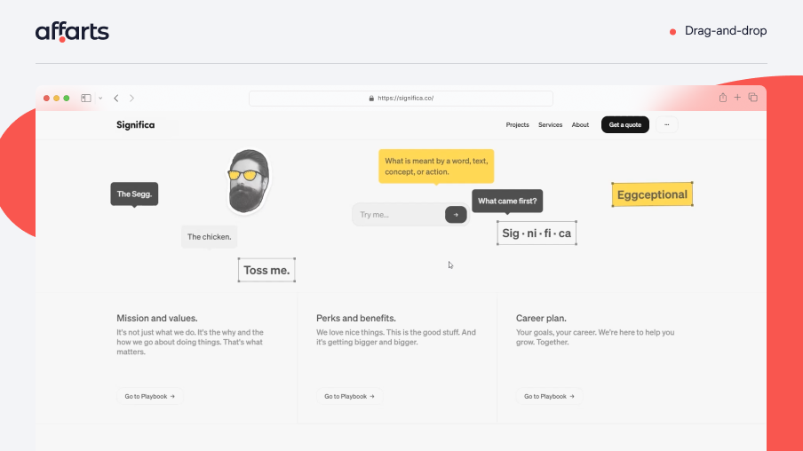
4. Drag-and-drop
Drag-and-drop, or drag-and-drop, is becoming increasingly popular. It is an imitation of physical actions, such as picking up and moving objects on the screen. This allows visitors to interact with the site in a more tactile way.
For example, some sites allow visitors not only to click on the home page slider controls, but also to drag and drop different slides to view projects. And transitions between pages and animations can depend on dragging speed. This gives the user a sense of control over the effects.
What do we like? The feature makes the site more interactive and engaging, increases user engagement, and allows users to feel in control of the page content.
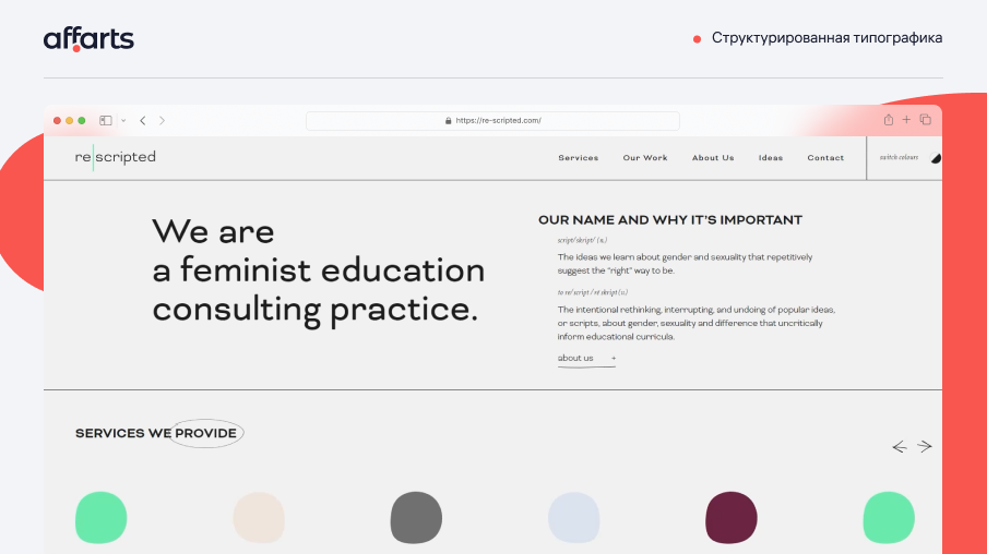
5. Structured typography
Structured typography is becoming increasingly popular for headlines. In a complicated world, people are looking for the confidence and stability that structured typography reminds them of. This technique uses all capital letters and solid forms, creating a strong visual impact.
Structured typography can improve the appearance of your website. The impressive use of structured fonts is sure to make a lasting impression on your visitors.
What do we like? This method can direct the visitor's eye to important content, creating a clear and effective visual hierarchy.
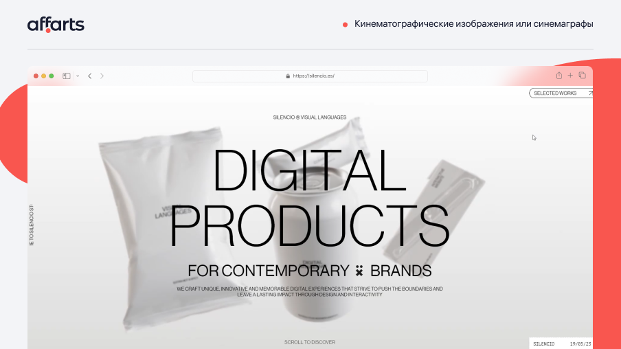
6. Cinemagraphs
In 2023, web design trends are all about adding motion. Cinemagraphs do a great job of this. High-quality videos or continuous loop GIFs bring motion and visuals to static web pages.
Cinematic images can replace both full-fledged heavyweight videos and static pictures, and produce an effect on the user, in a number of cases, even more. The fact is that cinemagraphs bring only part of the image to life, with its effects and scenes that you might not notice or miss on a full video.
Cinemagraphs are usually in GIF format and are very easy to install on your site. The main difference between cinemagraphs and regular GIFs is the subtlety of the movements with only one element coming to life.
What do we like? Unlike GIFs, our eyes don't get tired of looking at cinemagraphs.
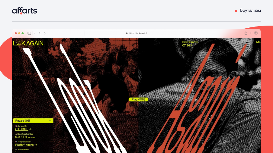
7. Brutalism
Brutalism is a special kind of web design. It lends itself well to unusual, creative brands and individuals.However, brutalism is not like modern design trends such as minimalism or flat design, which aren't going anywhere.
While there are many great examples of brutalism today, many of these brands have blended old-school brutalism with modern design trends to ensure they are user-friendly. We encourage you to keep this in mind if you are thinking about using brutalism in web design.
Today's consumers are used to attractive interfaces. Taken to an extreme, brutalism may cause them too unpleasant feelings. So striking a good balance between brutalism and modern minimalism would be a safe way to play with this technique.
What do we like? Brutalism stands out among the usual styles and standards. It creates unpredictable and atypical visuals.
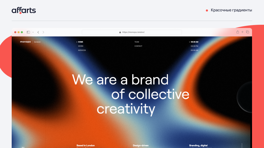
8. Colorful Gradient
For a long time, gradients have been actively used in design and have not relinquished their popularity, but designers continue to find creative ways to use them. They can be used as a bright background, adding depth and dimension to a design, or even as a subtle texture on an illustration. Gradients add creativity, and we can't wait to see where this trend goes next.
We're taking gradients to the next level by combining them with other design elements like patterns and textures to create unique and attractive visual effects. With so many possibilities, it's no surprise that gradients remain a popular design trend. When we add gradients to our designs, we create visual interest and depth while maintaining a clean and modern look.
The world of web design doesn't stand still, so we can expect even bolder use of gradients in the coming years. From bold and bright colors to subtle and understated gradients. We can be sure that this design element isn't going anywhere.
What do we like? Whether you choose a subtle gradient or a bold and bright one, this design element is a versatile way to add some zest to your web design.
9. Layering
We recommend taking advantage of the layering trend if you want to enhance your design and create an unusual visual. It's a powerful tool that can give your site depth, intrigue and personality, ultimately impressing your audience. Three layers are the standard for most elements:
Background: Often an image, texture or static layer
Intermediate: Often some type of image or interactive element
Foreground: often includes typography or images (the middle and foreground layers sometimes work together (or vice versa) to create a complete design.
What do we like? Designers can play with different combinations of elements, adjusting their opacity, position and size to achieve the desired visual effect. The result is a visually rich and attractive website that stands out from the crowd.
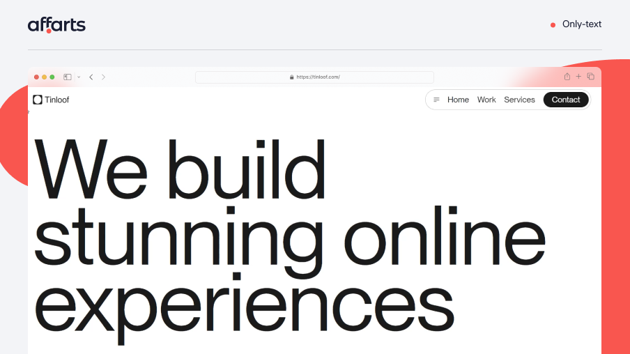
10. Only-text
Web design never stands still, and the coming year will be remembered for mastering a new trend. Concise and simple text began to replace images, animations and even navigation sections, helping the user to understand the company's message.
This approach makes it easier to understand the information, presenting it in a clean form without cluttering the page, which creates a contrast with other sections, such as the portfolio, which is impossible to imagine without a large number of animations and even cinematic inserts.
We appreciate this minimalist approach because it allows visitors to get only the information they need, without unnecessary distractions. This not only simplifies the user experience, but also enhances the overall aesthetic appeal of the site.
What do we like? We like this approach because it allows the user to quickly get only the information they need without being distracted by extraneous factors, which is why we like the way it works.
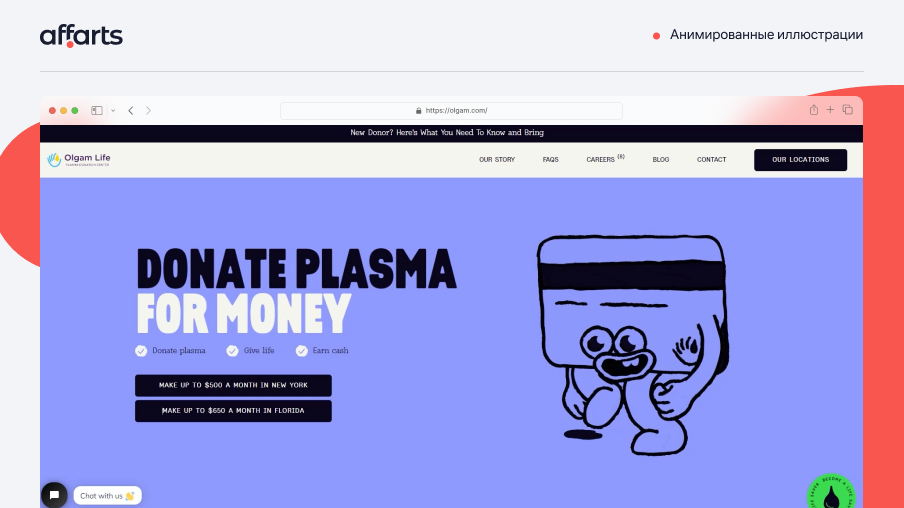
11. Animated illustrations
Animated illustrations have remained a favorite trend in web design in recent years. Many designers bring interactivity to the illustrations, it helps to bring an exciting variety to the site and increases the usability these facts will enhance the status of your website
It is worth noting the benefits of animated illustrations as a design element. Bright and interactive animations will focus the user's attention on the necessary section of the site. Animation is easier to convey information to the user. More and more often, users are using mobile versions of websites, and the use of animations in the design will speed up loading pages and make the interface easy for the user.
Animated illustrations are a modern artistic approach to improve the design and functionality of the website. With increasing competition in the design market, every company is looking to stand out. Based on this, we can assume that this trend will continue to gain momentum in the years to come.
What do we like? We use this to convey a complex or informative idea that static images couldn't handle.
12. Ultra-minimalism
Web design trends come and go, but one that has stood the test of time is minimalism. Over the years, this design style has evolved, giving rise to a more extreme version known as ultra-minimalism.
Ultra-minimalism is gaining popularity because of its ability to increase usability and increase site load time. The advantages of ultra-minimalism are obvious. By reducing the number of elements on the page, is greatly reduced loading time. Ultra-minimalism can be very effective, drawing the user's attention to the most important elements of design. The key to a beautiful minimalist site is a solid and structured layout, as well as an emphasis on stylish and well-designed typography.
What do we like? Thanks to the minimal styling and limited use of decorative elements, we can easily adapt the ultra-minimalistic design to suit different brands and themes. This allows us to create unique and personalized sites that meet the needs and goals of a particular brand or project.
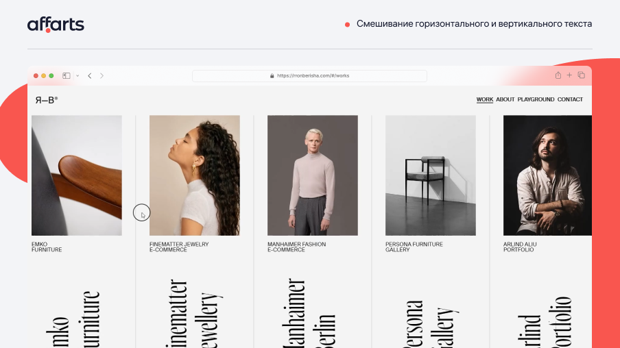
13. Mixing horizontal and vertical text
One way to make text on a page fresh is to mix horizontal and vertical alignment. By doing away with the usual horizontal alignment, designers can create unique and eye-catching design elements. This technique has become increasingly popular in recent years and is often used to add depth and volume to a site. This approach gives the page a unique feel.
What makes this design direction particularly appealing is its ability to defy convention. Users can be intrigued by websites that depart from the norm and experiment with new design elements. Blending horizontal and vertical text is a great way to achieve this effect, and designers can use this technique to create visually striking pages that grab users' attention.
Overall, the trend of mixing horizontal and vertical text is a powerful tool for designers who want to add uniqueness to their site designs.
What do we like? By experimenting with different alignment options, designers can create visually striking pages that stand out from the crowd.
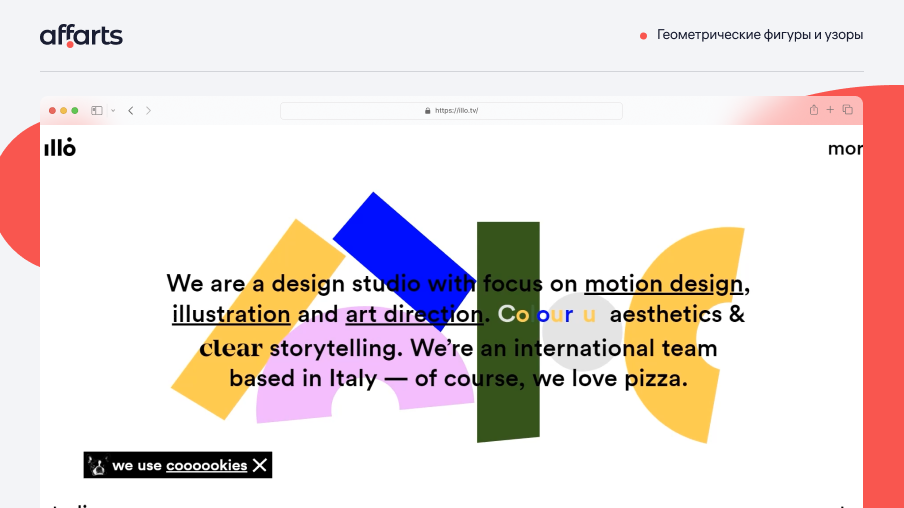
14. Geometric shapes and patterns
Geometry is everywhere - in our architecture, everyday objects, clothing, websites, and applications. It is one of the fundamental sciences, so it makes sense that we see it in our art, technology, and everyday objects. But you didn't have to love geometry in school to use it now in design.
Designers use geometric website design for three main purposes:
Navigation: Lines and shapes are typically used to intuitively guide users through the site. They lead them to calls to action and important sections of the site that the site owner wants the audience to focus on.
Visual Effect: There are many forms that can add clarity to site elements and give users a new perspective for a better experience. This helps sites stand out from the typical sites used by other competitors. Geometric design is the best way to make a site visually appealing without being overwhelming.
Framing: A geometric shape can be used as a tile to place important information, such as images, that should be highlighted for visitors from the rest of the site content.
What do we like? Geometric shapes and patterns create fantastic UX-UI design, and they're now very popular in app design. Geometric elements and patterns can be used to create eye-catching website designs.
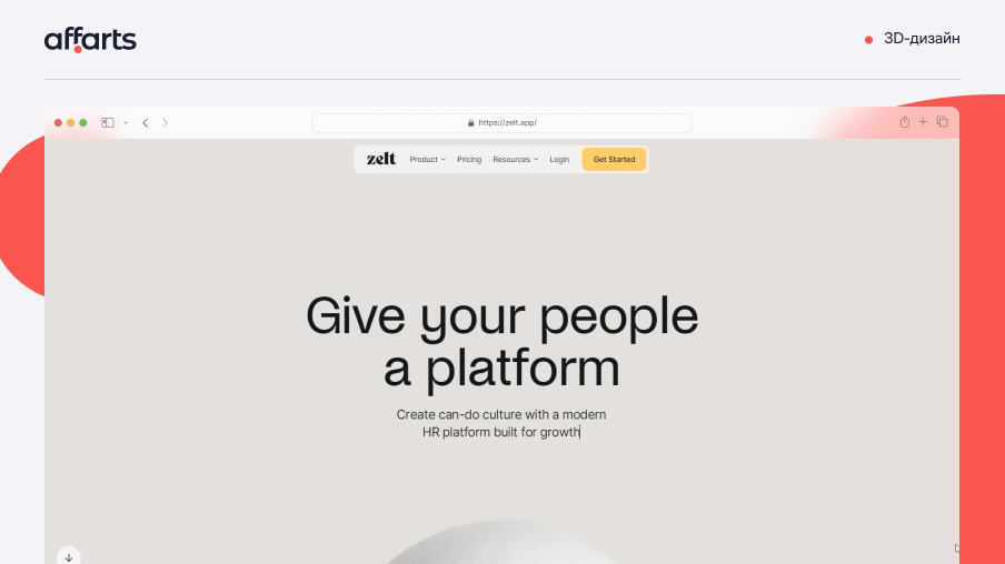
15. 3D Design
3D design adds shadows and detail to elements such as interactive scrolling, dynamic text and graphics to add depth.
Why use 3D design?
- As web designers, we use different design elements to create the best possible user experience (UX). Adding new dimensions creates visual variety and directs people to the information they need.
- Make the products on your site stand out. Flat design and a minimalist approach are common in modern web design. 3D elements attract attention. They make websites more intriguing by emphasizing features such as product images, navigation elements or calls to action.
- Interaction with site visitors. 3D design helps visitors interact with a website in new ways. Interactive design includes realistic moving elements and dynamic backgrounds to distinguish the site from ordinary pages.
What do we like? We use 3D designs to draw attention to an image, text or other detail, and add interactivity.
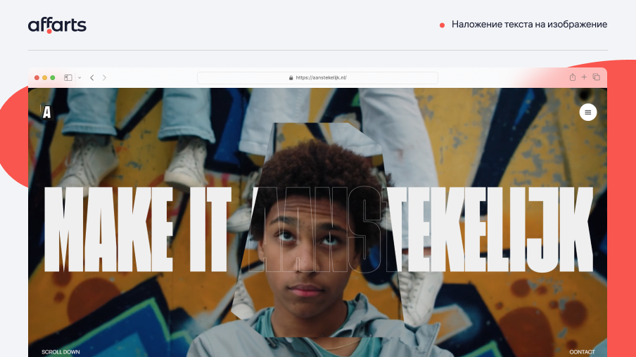
16. Text overlay on image
A stylish effect for blogs and portfolios is to overlay text and images on top of each other. This creates unique visual interest and adds depth to the design. This technique is often used to highlight important information or make a statement. The overlay effect can be achieved by carefully arranging text and images or by using graphic design software. It is important to balance the amount of overlap so as not to make the text difficult to read or the image too saturated. In general, overlaying text and images can be an effective way to create a visually appealing and memorable design.
What do we like? Overlaying text on top of an image increases the space on the page.
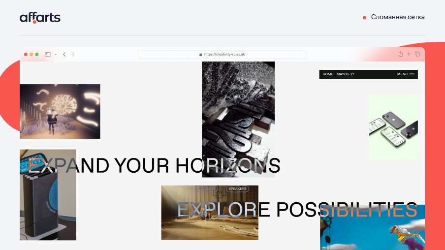
17. Broken Grid
Is it possible to be unique and creative while staying within the literal boundaries of columns and rows? If you want to take a risk and push the boundaries of your site design, try using a broken grid layout.
A broken grid is a web page layout that violates some of the standards of a traditional grid. This can mean changing column widths and/or row sizes, overlapping and stacking elements, animations or other techniques beyond what the grid system dictates. If you want to set your brand apart from the competition, broken grids are one design approach to achieve that goal.
Like a standard grid layout, a broken grid layout is not a set of rigid rules-you can break the grid in several ways. Breaking the grid usually doesn't mean throwing all grid-related concepts out the window. Sometimes even subtle variations of established techniques can add visual appeal.
If you're just starting out, the best approach to designing with a broken grid is to first create the page in a grid system, and then modify the grid style using CSS or a GUI tool to create something original.
You can sketch out ideas beforehand or experiment - either way, it's easier to work with a pre-created grid than to style element placement from scratch.
What do we like? We appreciate the bold approach, and we're not afraid to go above and beyond. You can make the standard sections of the site more interesting.
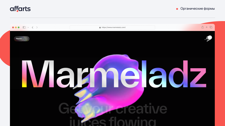
18. Organic forms
Organic shapes will be one of the biggest trends in web design in 2023. These shapes have become a popular way to add playfulness and creativity to web pages, and they displace the sharp edges and straight lines that dominated web design in the past.
Organic shapes are irregular, fluid and asymmetrical. They are inspired by natural forms such as leaves, rocks, clouds and waves. Organic shapes don't have geometric outlines, so they look more natural and free-spirited.
Organic shapes can help add some playfulness without affecting the way the information is displayed. They create a sense of movement, depth and visual interest that draws the viewer's attention. They can be used as backgrounds, buttons, icons or illustrations.
There are many tools and resources for creating organic shapes, including Adobe Illustrator, Sketch, Figma, and Canva. Many web designers and developers are also experimenting with generative design, which uses algorithms and machine learning to create unique organic shapes that cannot be replicated by hand.
What do we like? It's a fresh and exciting way to give web design personality and creativity. This trend is a response to the growing demand for designs that are more exclusive, human-centered and less rigid. Organic forms can help make web pages more engaging, memorable, and enjoyable for users.
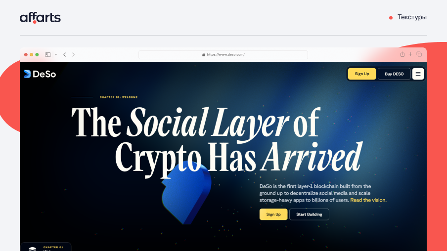
19. Textures
In the visual arts, texture is the perceived quality of a surface. Visual texture is the illusion of having physical texture. Every material and every supporting surface has its own visual texture. The use of textures can convey different messages and emotions and create a sensory experience for site viewers.
Textures are used in all kinds of design, from brochures and business cards to apps and, of course, web design, where they are extremely common. There are many high quality and free textures on the market.
Web textures are background images that visually resemble a three-dimensional surface.
What do we like? When textures are used correctly, we immerse visitors in the atmosphere of the site and draw attention to the desired section.
20. Grid
The concept of grid layouts originated in print design when they were used in typography to organize handwriting on paper, especially in books and newspapers.
The grid system helps align page elements based on consistent columns and rows. Once we have this structured framework, we can place text, images, and any design elements in the interface in a consistent, orderly manner.
Grids help separate pages horizontally and vertically using rows and columns. Grid systems serve as a systematic approach that allows designers to place elements in an orderly fashion and provides a modular approach to developing components for multiple pages or layouts. Grids also define a consistent set of fixed units of measurement that dictate the dimensions, spacing, and alignment that each design element must adhere to.
What do we like? Grids help structure and organize content on the page. Plus, the grid creates an intuitive site structure. It makes it easier for users to find information and navigate.
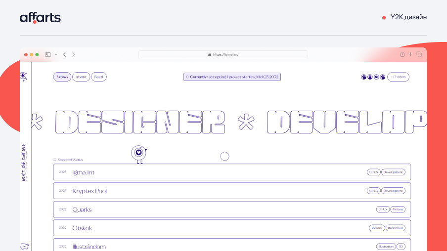
21. Y2K Design
The Y2K aesthetic is a web design trend that draws inspiration from the early 2000s and the turn of the millennium. It is characterized by a bright color palette, bold typography, and the use of futuristic elements such as glitch effects, pixel graphics, and 3D shapes.
The aesthetic of the 2000s, known for its bright and pastel colors, collages, cute icons and cyberspace-inspired design, has completely caught on in social media. There were a lot of adventurous decisions in the design of the 2000s. Often fonts that emphasize decorative elements such as thick outlines, shadows, bold or italic letters are the types of typography that bring us back to the feel of 2000. Whether it's in your web design or in your logo and other branding elements.
What do we like? This kind of design can make a brand stand out in a crowded marketplace and get rid of unnecessary seriousness.
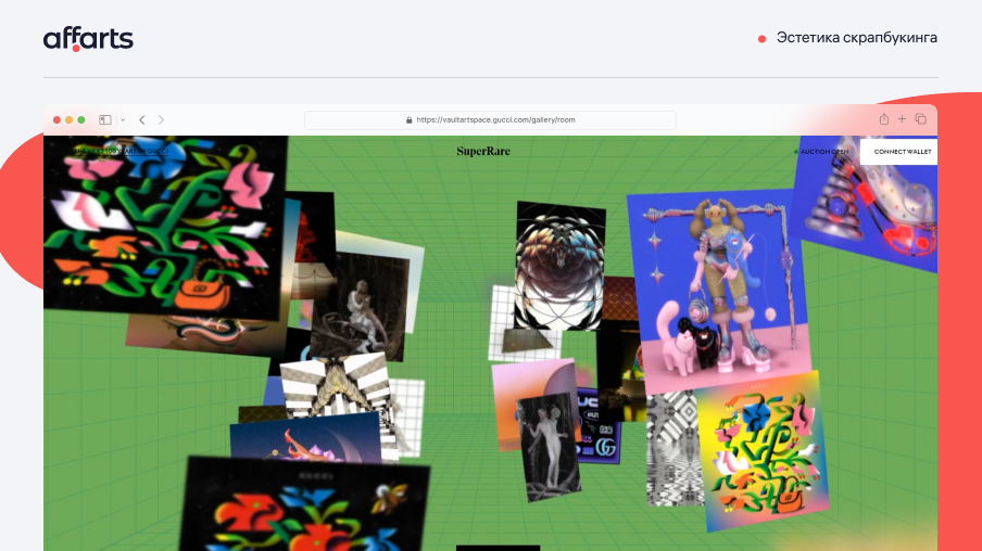
22. Scrapbooking aesthetics
One original, memorable, and fascinating approach is the use of scrapbooking, which brings out the best in layering, when applied correctly, of course.
Implementing this artistic method can be very challenging, especially when a lot of multimedia content is involved, which is commonplace these days; avoiding clutter and an overwhelming look is a strict condition that must be met to achieve the desired result. And this is only a small part of what needs to be taken into account.
What do we like? Scrapbooking creates a sense of nostalgia and fond memories. This scrapbooking aesthetic appeals to users who appreciate retro style.
23. Gamification
Gamification has become one of the most interesting UX design trends in recent years. Regardless of the "seriousness" of the tasks we perform with apps, we still prefer those features that give us laughter and fun. Gamification can be a great solution. It allows us to turn even the most tedious processes and everyday activities into fun for users. Here we'll take a look at this concept under the magnifying glass, as well as the benefits of gamification in UX design.
Gamification is a technique for introducing game mechanics into non-game products. It is a demonstration of caring for users as a brand tries to make the UX of a product fun and engaging, like a game. We can see gamification in financial apps, digital banking systems, health apps, language learning apps, etc. It has become an integral component of many great mobile apps and software products. It usually includes animations and illustrations that enhance the UX. It increases user engagement, builds loyalty to the app creator and retains users.
What do we like? Playful elements evoke interest and other emotions in users, which increases their engagement with your website and brand.
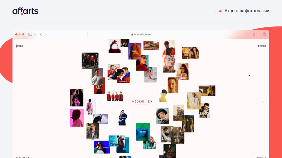
24. Emphasis on photography
2023 is the year when product photos will dominate e-commerce sites. From cosmetic companies to clothing brands and beyond, product photos will take center stage in 2023.
Product photography isn't just a way to show your products to potential customers. It's an important part of your marketing strategy, helping to build trust in your brand and your business, keep visitors on your site and show the value of your product.
When you're selling a product, whether it's food, appliances, clothing, or anything else, you need the customer to be able to visualize the details and understand exactly what they're buying. Without quality photos, it's hard for them to determine if the product is right for their needs.
What do we like? Photos are the best and most effective way to convey those details and tell the story of how the product will fit into the buyer's life.
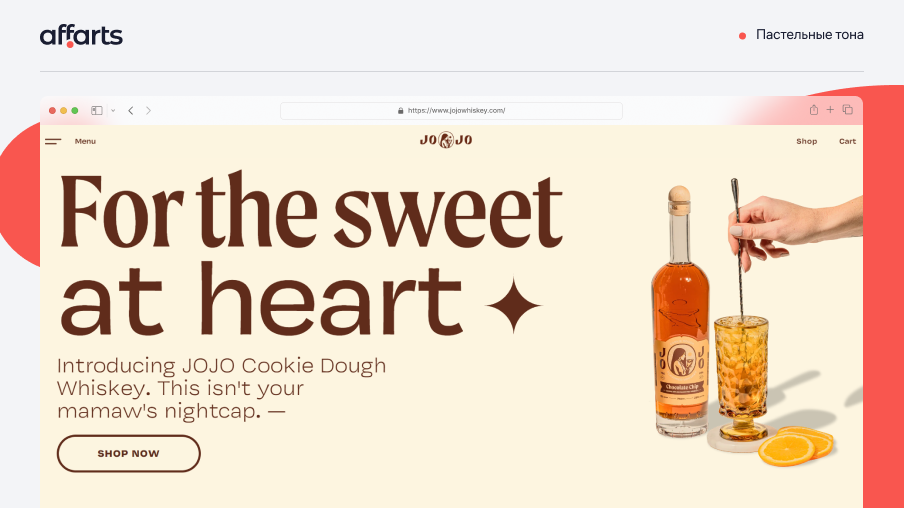
25. Pastel Tones
Websites with a minimalist approach, use a washed out color scheme, evoke a sense of sophistication and purity. The use of a particular color scheme in the design is driven by several ideas: supporting corporate colors, creating a certain tone of web presence, and evoking desired emotions in viewers.
There are not many shades in the pastel color scheme, so the design made in it never looks over saturated. It is most often used for backgrounds (textures and images), logos, icons, fonts, frames. Of course, it doesn't matter where you apply pastel colors. The main thing is the result you achieved - an elegant and pleasant look of the site. Most vintage designs prefer pastel color schemes because they are perfect for creating the desired retro or soft atmosphere.
Pastel color schemes can also be visually contrasting by mixing one or two washed out colors with a strong color (such as dark gray). They are still pastels, but create a more contrasting effect.
When choosing the most appropriate colors for your site design, find out what the site does and who its target users are. If the site is about children's sporting goods, black may not be appropriate; instead, bright colors such as red, green, and yellow will enhance the experience.
What do we like? Pastel colors convey a soft and friendly atmosphere to the site, evoking calm and trusting emotions.
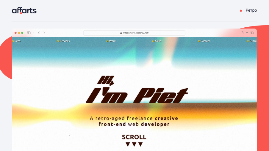
26. Retro
Retro design can make a site dynamic, functional, cozy and even modern. This trend is common to all kinds of sites, from online stores and corporate sites to personal sites such as portfolios and blogs.
Here are a few common traits inherent in retro website designs:
A return to a specific decade: A site often mimics a specific decade or moment in design, rather than several.
Shapes, lines and textures: Designers often use elements that were prominent in a particular decade to create a more suggestive retro feel.
Previously fashionable fonts: Using fonts that were fashionable in past decades is an easy way to give a site a retro feel without changing much. There are many free font libraries to help you find one that fits your client's taste while adding another dimension.
Functionality: Retro sites mimic old design styles, but prioritize modern navigation and functionality.
What do we like? Retro sites create a connection with the user, evoking pleasant and nostalgic feelings
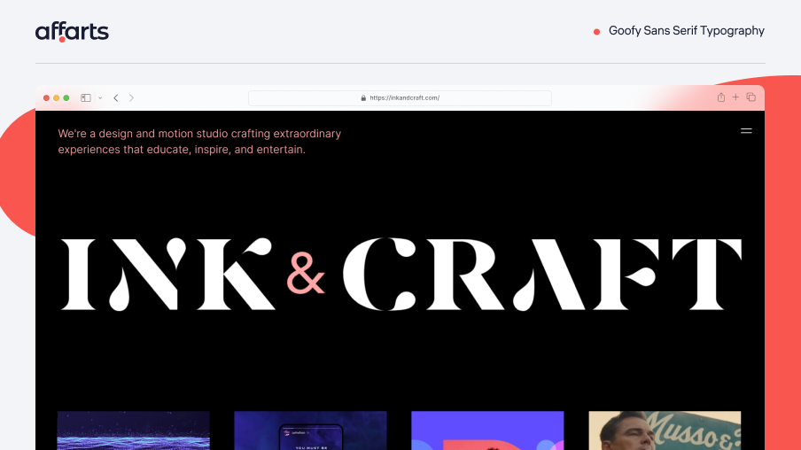
27. Goofy Sans Serif Typography
Goofy Sans Serif Typography is a typeface with a playful and carefree design. It is ideal for brands and companies that want to convey a lighthearted attitude to their audience. This font is characterized by rounded shapes, jagged strokes, and quirky details reminiscent of a cartoonish look from old-fashioned comic books.
The design of the Goofy Sans Serif Typography font is influenced by retro and vintage aesthetics, making it ideal for brands that want to evoke a sense of nostalgia or create a design inspired by the spirit of yesteryear. It's also versatile enough to be used in a wide range of design projects, from branding and marketing materials to website and app design.
The playful and fun nature of the Goofy Sans Serif font can give personality and character to any design. It can help create a memorable and unique brand identity, as well as enhance the user experience by making designs more engaging and appealing.
What do we like? Whether used for headlines, main text, or graphic elements, this font is sure to bring whimsy to any design and differentiate it from conventional fonts.
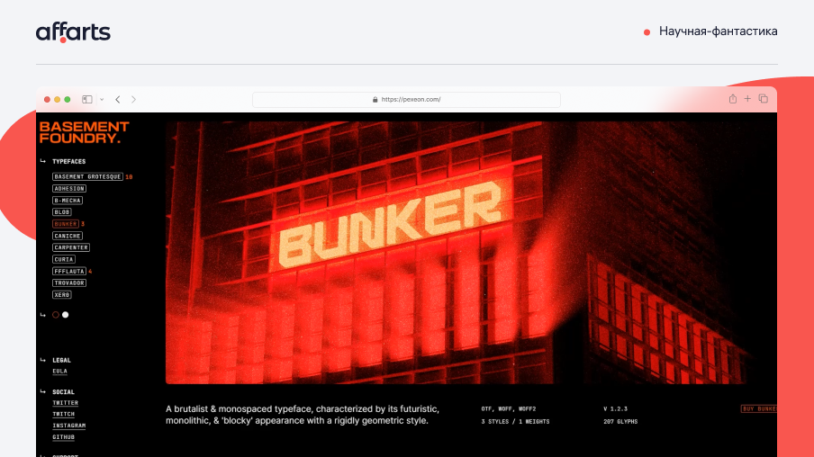
28. Science Fiction
The trend of using science fiction in web design is to create an exciting and futuristic experience for site visitors. It's like a journey into a new world or dimension, like a movie.
We use elements such as space themes, neon colors and futuristic fonts to create a visually stunning and exciting website. This trend is especially popular in industries related to technology, gaming and entertainment.
What do we like? By incorporating sci-fi elements into their web design, companies can attract a younger, tech-savvy audience who enjoy exploring new worlds and ideas.
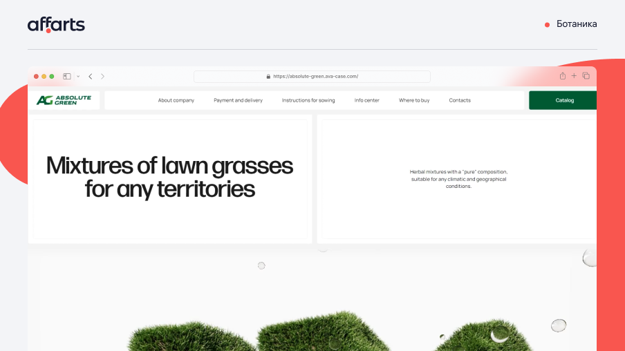
29. Botany
Nature has been a source of inspiration for designers and artists for centuries. Nowadays, the issue of ecology is more and more raised in the world. This theme has influenced design as well.
From botanical illustrations to eco-branding to sustainable web design, organic design is incredibly versatile and can be integrated into almost any medium, style or technique.
Replicating the natural palette of our environment, neutral colors, are one of the easiest and most effective ways to evoke a sense of organics and naturalness in design. In addition to the soft browns, beiges, whites and grays that come to mind when the word "neutral," faded pinks, blues and greens can also be great additions to your neutral palette.
Unlike styles that simply draw inspiration from nature, botanical design is usually a direct representation of flora in its natural form.
What do we like? Botanical design is appealing because of its environmental-themed aesthetic and uniqueness. It can be effective in supporting your brand identity and capturing the attention of your target audience
Conclusion
We've shared with you the major trends in web design for 2023. From 3D design and mixed reality to organic shapes and visuals inspired by science fiction. Bright and bold colors will grab attention and create an emotional connection with your audience. And typography will add uniqueness and character to the design, emphasizing your personality. We're not forgetting the dynamic animations that will bring your site to life and make it interactive.
Some of these trends may be more appropriate for certain industries and brands. It's important to be able to use the trends correctly and appropriately so as not to overwhelm the design and make it user-friendly.
We experiment with different techniques to capture users' attention and enhance brand value. That's why we are ready to realize the most daring ideas.

