
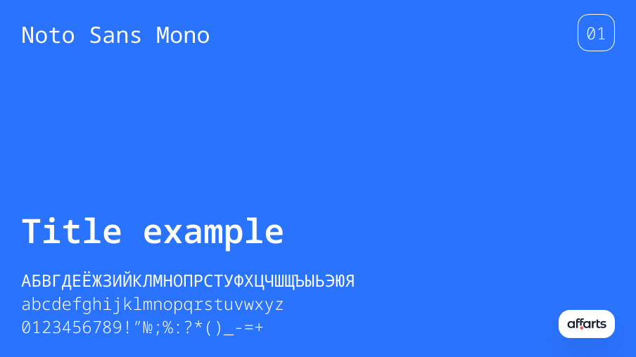
Noto Sans Mono
Noto Sans Mono is a sans serif monospaced font that is great for situations where a fixed width is required. It conveys typewriter-like shapes well, which adds to the individuality of the font. This font supports Latin, Cyrillic and Greek fonts as well as various symbols. You can download it in several weight and width options, as well as 3,787 glyphs.
Pt Serif
PT Serif attracts attention with its clean lines and exquisite detail. Its wide letter spacing provides better readability and ensures that the text remains clear and light. The curves of this font add elegance and finesse, adding sophistication to any design.
It offers a harmonious balance between aesthetics and functionality, making it the ideal choice for different applications. It is used in website design, for printed materials or branding elements. PT Serif adapts easily to different contexts, enhancing the overall visual appeal. It proves time and again that it is a reliable aid for designers looking for a font that strikes the perfect balance between elegance and usability.
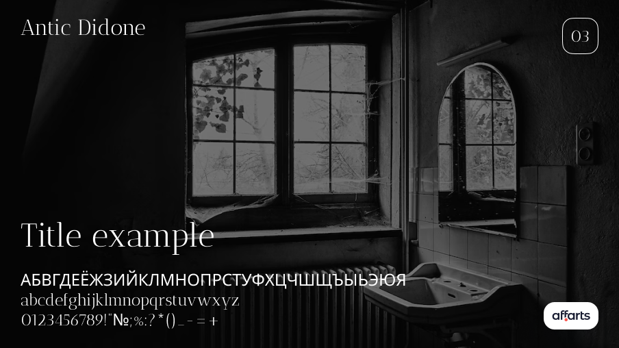
Antic Didone
Antic Didone is an elegant font that is perfect for headings and subheadings. Originally designed for newspaper and magazine headings, the font is easy to read thanks to its large x-height characters. The slim weight and patterned serifs give it a modern style elegance. However, the thin lines make it too light for use in basic text. It would look great as a logo for a beauty brand, fashion blog or photography websit
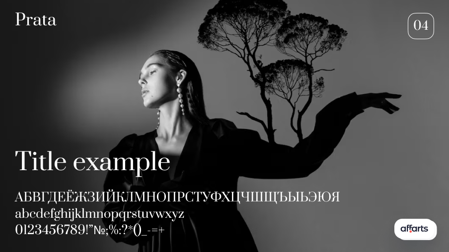
Prata
Prata boasts a rich variety of letterforms. With its varied letterforms, Prata draws attention to headings. This font will add sophistication and refinement to your design. Whether creating a luxurious atmosphere or evoking a sense of timeless beauty, Prata adds a touch of sophistication to design themes. However, when using it in smaller sizes, care should be taken to ensure legibility. Prata is great for creating captivating headlines, but its readability can be impaired when used in the body of the text.
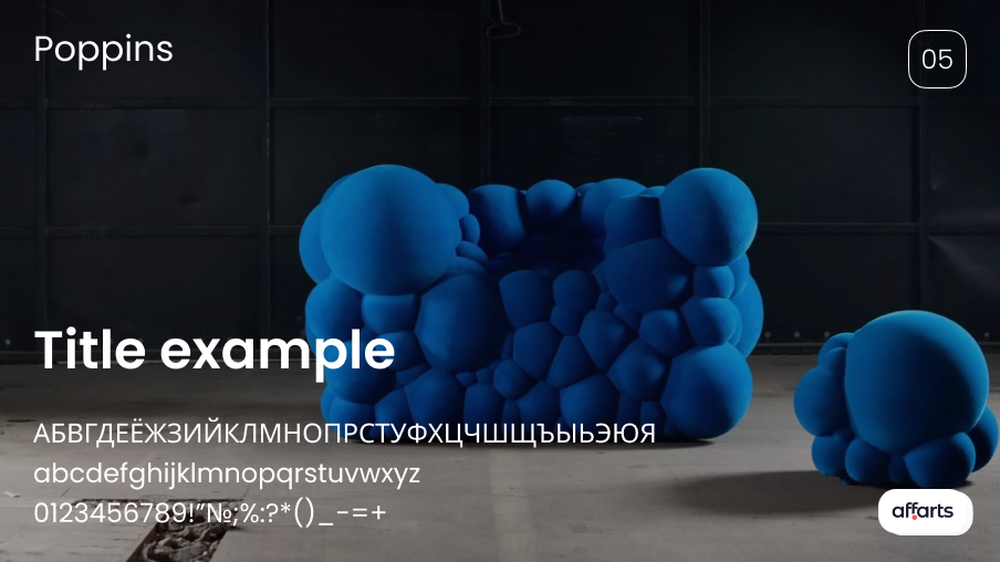
Poppins
Poppins' slightly rounded edges make it appealing. Its letterforms are proportional, incorporating wider shapes. These characteristics make Poppins an excellent choice for headings and important text that graphic designers may need in their creative compositions.
The rounded edges of Poppins soften its overall appearance, helping to create a friendly atmosphere. This subtle curve gives the typeface a warm feel, making it suitable for projects that aim to create a welcoming and friendly tone.
Poppins' letter spacing is standard for legibility and readability. The wider lettering design enhances the visual impact of the typeface, making it particularly suitable for headlines and other prominent text elements. Whether it's a website headline, a banner or a striking magazine headline, Poppins catches the eye with its clear letterforms and wider shapes.
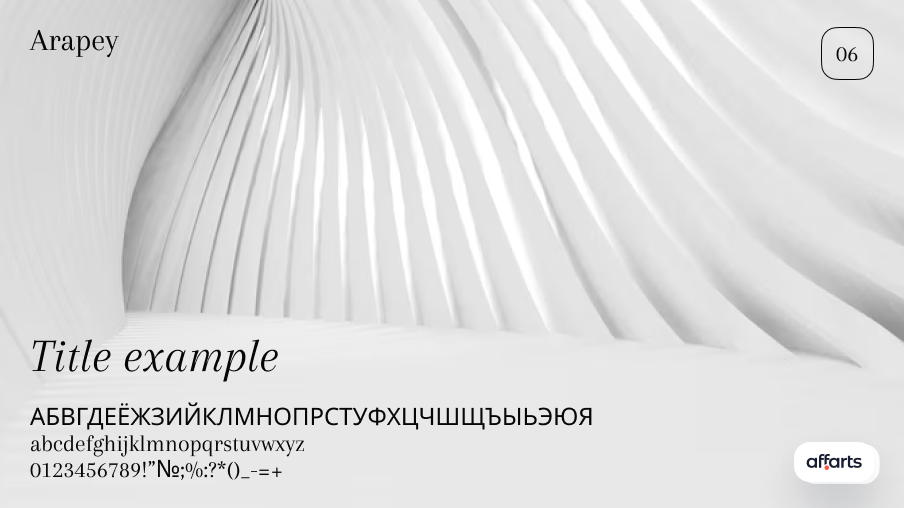
Arapey
Arapey is a modern font similar to Bodoni. The thin lines give the font an elegant and distinctive look. We recommend using this typeface only in headlines due to its thin lines, which adds to its attractiveness and special look. The presence of an italic version gives the font extra versatility. Although Arapey is best used primarily for headlines due to its lighter weight, it remains an excellent choice for creating visually striking and complex type compositions.
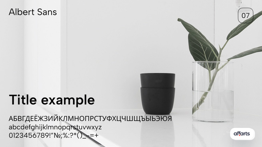
Albert Sans
One of our favorite serif fonts is Albert Sans. This modern geometric font is inspired by the typographic characteristics of Scandinavian architects and designers of the early 20s. If you're looking for something clean and easy to read, Albert Sans could be perfect for your next project. The font includes many weight and style options. It also supports more than 200 languages.
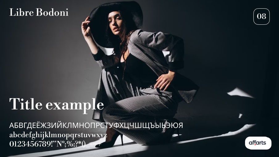
Libre Bodoni
Libre Bodoni has long been a popular font - but it usually requires a special license to use. That's one reason why we love this version on Google Fonts. It's well adapted today, and its editorial style makes it ideal for anything related to luxury, fashion and style. Although it's best used for headlines, the font is available in several different styles and weights. It will look great in plain style for main headings, italic for subheadings and bold for accents.
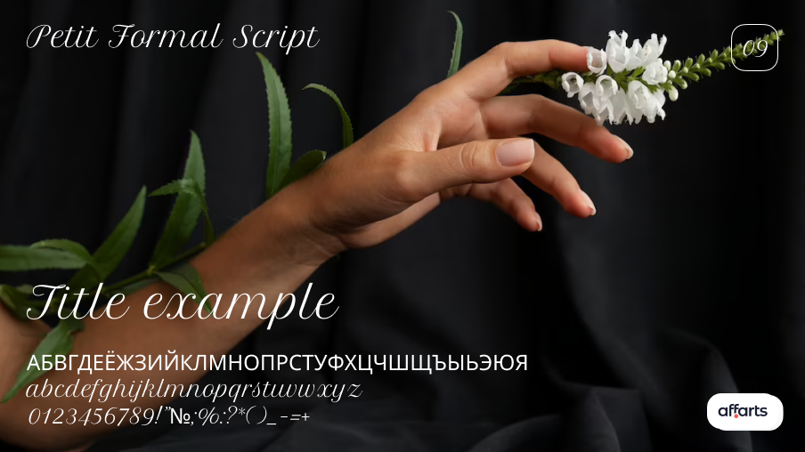
Petit Formal Script
Petit Formal is a classic font that exudes elegance and sophistication. It is ideal for wedding invitations, thank you cards and any other formal occasion. This font contains a full set of 429 characters, including upper and lower case letters, numbers and special characters.
The Petit Formal font can be used to create logos, posters, book titles, clothing design, magazine covers, invitation cards, shop names, brochures and many other graphic projects.
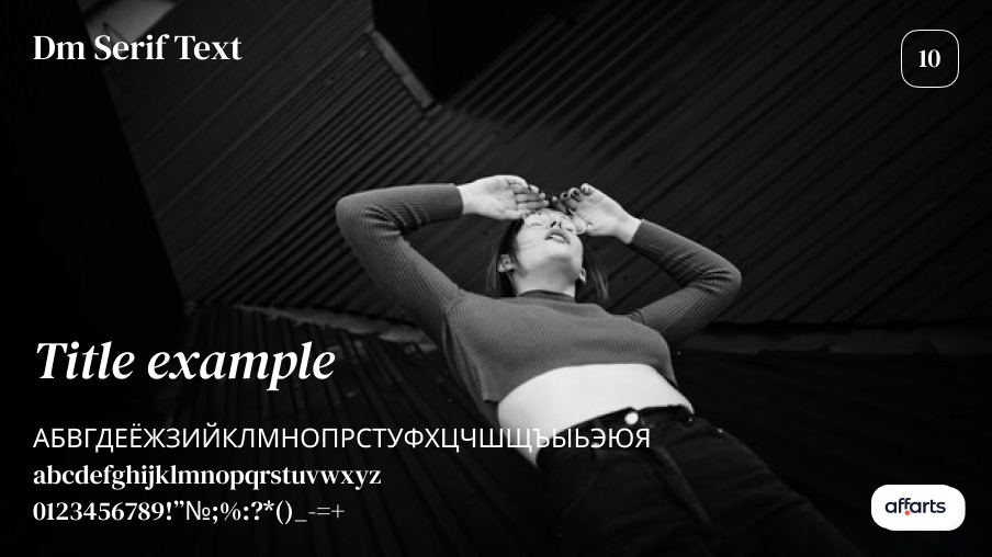
Dm Serif Text
Those looking for a modern and playful typeface should consider DM Serif Text. The striking contrast between thick and thin strokes makes it dynamic and eye-catching. Therefore, the font is great for headlines and attention-grabbing texts. However, care should be taken when using this font. Especially for smaller text or the main body, as the thin serifs around the edges of characters can create a tense and unreadable look.
The sharp variation between thick and thin strokes in the lettering of the font creates a visual and dynamic effect. This striking contrast catches the eye and gives the headlines an exciting touch, making them stand out from the rest.
Cormorant Garamond
Stylish and timeless, Cormorant Garamond is a remarkable font that embodies elegance and sophistication. With its sophisticated design, it offers a diverse range of 9 inspiring variants, each available in 5 different weights, satisfying any graphic design need. The beauty of the Cormorant Garamond lies in its attention to detail, graceful curves and balanced proportions. Its harmonious blend of classic and modern elements makes it the perfect choice for both traditional and contemporary design aesthetics. Whether for headlines, body text or branding materials, this font exudes a sense of sophistication and refinement.
Nanum Myeongjo
Nanum Myeongjo is a beautifully crafted serif font that has a similarity to Cormorant, but also offers a touch of modernity. It was originally created for the Korean alphabet. But now Nanum Myeongjo perfectly supports Latin text, making it a versatile choice for designers.
The elegant and refined characteristics of the font make it the perfect companion to the fine sans-serif fonts. When paired, they create a harmonious balance between traditional and modern design elements. The font is quite versatile. Its legibility and readability make it suitable for body text, especially when a combination of serif and sans serif fonts is required. Using Nanum Myeongjo, a visually coherent layout can be created that is eye-catching and easily understood by the reader. Thanks to its ability to combine the traditional with the modern, Nanum Myeongjo is a versatile choice if we want to add an element of elegance and modernity to our font compositions.
Crimson Text
The focus of print editions, Crimson Text, offered in three weight options, resembles the traditional elegant style in books, magazines and newspaper articles. Designed for optimum reading, this serif typeface features generous spacing for a more open reading experience.
In addition, Crimson Text's large character set includes various typographic features such as ligatures and alternate glyphs, adding versatility and visual interest to any typographic layout. This attention to detail allows designers to create unique compositions.
Space Mono
Space Mono is the original fixed-width font family developed by Colophon Foundry for editorial use in headlines and display typography. Its letterforms combine a geometric base with grotesque detail, evoking the spirit of 1960s newspaper headlines. Its features include old style numerals, superscript and subscript numerals, fractions, currency symbols with central and uppercase letter heights, directional arrows and several stylistic alternatives.
Cormorant Garamond
Cormorant Garamond is a very popular Google font. This font is a hit in the American market and is used on more than 2 million websites in this country. Sleek and stylish, Cormorant Garamond offers 9 inspiring designs in 5 different weights for any graphic design. With its classic serifs, Cormorant is beautiful at almost any size. It comes in a variety of styles (italic, bold, etc.) and looks great on a website (look at Positano for an example). We like to use Cormorant for body text if you're looking for something easier to read.
Work Sans
Another classic design font with a touch of restraint. Work Sans lives up to its name, being a great option for professional themes. It is available in 9 variants plus matching italics. This font is functional, giving it a fresh and reliable feel.
Alegreya
Alegreya is a versatile serif font that combines classic elegance with modern sophistication. Its large family includes many weights and styles, providing flexibility for a variety of design projects. Well-proportioned letterforms and thoughtful spacing ensure excellent readability of the font on a variety of media. The adaptability of the Alegreya font allows it to harmonize with both traditional and contemporary design aesthetics. We create great solutions using Alegreya.
Archivo Narrow
Archivo Narrow is a family of grotesque sans-serif fonts designed for use in both print and digital platforms. The font is best used for emphasis and headings. This family was derived from Chivo and is reminiscent of late nineteenth century American fonts. Created by Omnibus-Type for high-performance typography, it supports over 200 world languages and includes plain, narrow and black styles. .
Anonymous Pro
Created by Mark Simonson, Anonymous Pro is a family of fixed-width fonts designed with coding in mind. It gives characters that can be confused with one another (O, 0, I, l, 1, etc.) different shapes to make them easier to distinguish in the context of source code. In addition, the regular and bold styles have built-in bitmaps for the smallest sizes. It was inspired by Anonymous 9, a free Macintosh bitmap font developed in the mid-90s by Susan Lesh and David Lamkins as a more legible alternative to Monaco, a fixed-width Macintosh system font.
Sora
With its large lowercase letter height and generous contrasts, Sora is an excellent choice for applications and web interfaces where clarity and efficiency at all sizes are important. This font family was commissioned by a Japanese company of the same name, which specializes in blockchain and is best known as the creator of the world's first central bank digital currency. Sora draws inspiration from low-resolution aesthetics and early screen typography without being burdened by nostalgia.
Inter
Inter is a family of variable lettering fonts that feature a high lowercase height (x-height) that improves readability of text, especially when using mixed uppercase and lowercase letters. The presence of contextual alternatives allows punctuation to be adapted to surrounding glyphs, and also includes an oblique zero to distinguish it from the 'o' symbol. Inter was designed by Rasmus Andersson, a Swedish
Rubik
Sebastian Fischer and Philipp Hubert created the Rubik font family, which contains 5 scales with Italic and Roman styles. Rubik's lightweight medium font gives the impression that the project is simpler than the task in the complex Lanara font. Rubik light is exceptionally suitable for headings and subheadings of text.
The Rubik bold font is shaped to present an ultra-modern look while still sticking to simplicity. It's far visually breathtaking and you can enjoy it with embellishments.Rubik Semibold is an open-ended font with a modern and trendy design. This font is designed specifically for children's or youngsters' names.
Fira Sans
Fira Sans is available in 4 variations: Regular, Medium, Bold and Light. It has a vintage style and the bold has beautiful patterns that can be used in almost any layout. Of course, this is related to the area of print or design.
This font is multipurpose, making it suitable for creating various assignments, invitations, antique formats, postcards, posters and book covers. It contains many families of lettering. You can use this sans serif font for various projects such as printing, advertising, poster design, social media posts, invoices, banners and many other related areas. It is also suitable for office work, and you can use it for various documentary purposes. Many designers use this font for branding, product headers, logos of various companies and presentations.
Open Sans
Open Sans is a sans serif font designed by Steve Matteson. Open Sans has a straight structure, open shapes and a neutral but friendly look. It is optimized for use in print, web pages and mobile interfaces, and has excellent readability thanks to its harmonious letters.
The font consists of different versions, and each version features different characters, making the text attractive and winning, and easy to use with sanpaullo's signature font. Open Sans has been designed with a vertical accent, open shapes and a neutral but friendly look. It is optimized for print, web and mobile interfaces and has excellent legibility of letterforms.
Lato
Since the release of Lato, every designer has tried to get their hands on this interesting font. You may have noticed this font on various websites. There is a long list of publications in which this font has been used. In many election campaigns, the Lato font has remained in the spotlight. The main reason for its popularity in print and magazines is that it makes small texts readable and legible. You can use this font on many platforms including your website, logos, posters, banners, displays, advertisements, designs, headlines, titles, etc. It will make your design stand out and allow you to compete in the market.
Old Standard Tt
Old Standard TT is a serif font that pays homage to the traditional typography of the past. It features classic letters with elegant serifs, conveying a sense of timeless beauty. Thanks to its broad character set, Old Standard TT supports different languages and special characters, making it versatile for multilingual projects. The legibility of the font and its clear spacing make it suitable for both print and digital applications, making it easy to read on different media. The Old Standard TT's vintage charm and attention to detail make it a popular choice for projects requiring a touch of nostalgia and sophistication.
Ubuntu
The Ubuntu font family, developed by design studio Dalton Maag, has been created to ensure that every menu, button and dialog box has a distinct personality. This sans serif font uses the features of the OpenType format and is manually adjusted for clarity on computer and mobile screens
Vollkorn
Vollkorn is a modern and unique bold typeface. It is important for headings and footers. We use this font to create the best designs.
Vollkorn is one of the most favorite fonts worldwide. It has extensive language support. It contains 427 glyphs as well as a thousand units per em. This font has a simple look that can be combined with any other font such as Calendas Plus, which also belongs to the serif font category. This font is best suited for use in headlines, labels, printed matter, invitation cards, playing cards and other purposes. It is easy to use for important documents.
Oswald
Most of the fonts we've included in this selection are either sans serif or sans serif - and can be used for both headings and body text. Oswald is a little different. Its tight, condensed style means it will only work for headings and short areas of text (no more than a few words). The tall letters make it difficult to read in large blocks, so if you're going to use a font like Oswald (or similar), do so sparingly.
Tenor Sans
Like the Oswald font, Tenor Sans belongs to the category of 'decorative fonts'. It can give a website more personality and its unique design makes it the best choice for headlines. It is recommended to avoid using Tenor Sans for body text and instead choose something that is easier to read in large blocks (such as EB Garamond).
Playfair Display
The Playfair Display font has advanced features. This serif font has three weights that are best suited for creative design.It has more than 238 characters that have small uppercase letters and display appearance symbols. This beautiful font is best suited to Roman patterns and attractive styles.
It is perfectly matched to the Tiffany font, which is good for getting flawless results in your project. This font is also applicable in CSS and Adobe applications. Many people like this font and use it in Microsoft Word for various purposes. It has another tool, the generator, which is available to all users..
Mukta
If you are looking for a more stable font with a uniform tone, then Mukta is just what you need. It comes in 7 variants, including italics, and supports other scripts such as Latin, Tamil and Gujarati, among others.
Quicksand
Quicksand is a pure geometric font. The design of this font was inspired by the geometric sans serif fonts of the 1920s and 1930s. Quicksand's sleek and expressive design embodies finer line and more space. A note of fun is given by its rounded edges and fuller arches and curves. Headlines, posters and advertisements are great vehicles for using this unusual sans serif font.
Raleway
Raleway is a sans serif font, and the design of this font was developed by professional designer Matt McInerney, and he is really very famous for creating great fonts.
Raleway is a sans serif font that can be used in a variety of designs due to its wide range of glyphs, styles and flexibility. The large number of weights and styles helps to use this font for a large number of projects. This font is also a great choice for creating logos, posters and many other designs.
Bitter
Bitter is a stylish serif font designed by Huerta Tipografica. It stands out among other sans serif fonts due to its unique and elaborate design. The font is available in OTF format, which gives it an elegant and stylish look that adds a touch of high quality to any project. This makes it available for use in a wide range of projects such as headlines, book covers, branding, app development and web development. Well-known companies such as Adobe and Microsoft have also used this font in their professional work. In addition, Bitter is popular on YouTube for creating eye-catching thumbnails and video feeds.
Merriweather
Another popular choice for websites is the robust and exemplary Merriweather. With its taller letter design and heavier weight, this font creates easy-to-read glyphs that are sure to have a valuable impact on a variety of media.
Noto Serif
Next on the list is the elaborate and slightly pumped-up Noto Serif. Elegant and flexible, this serif font offers not only 2 sizes, but also a huge number of fonts in different languages. With its large spacing and stable glyph design, it's no wonder that Noto Serif is featured on more than half a million websites and is compatible with all graphic designers peg.
Arvo
A font of Finnish origin, this glossy and heavy typographic design is equally creative and also retains an authoritative look. Arvo looks best on both print and monitor. With its thick letters giving it an imposing shape, it's perfect for headlines, headers, logos and billboards.
Lora
Lora has sharper tails and a modern look. The optimal choice whether you need prints or your design needs to be displayed on screens or both. It's a sleek font that can be a great tool for telling your story.
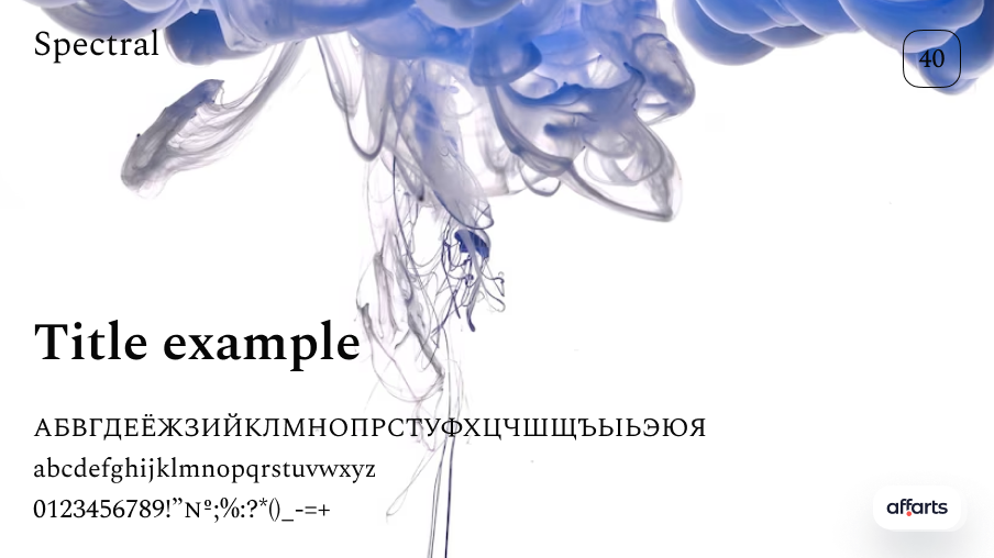
Spectral
The Spectral font has a very clear and unique design. Its sleek and modern style makes it the perfect choice for projects requiring clean, minimalist elements. This gorgeous font is perfectly coordinated with the Bembo font. It works particularly well for headings, subheadings and other large text blocks.
In addition, this stylish font is available in a wide range of weights and 7 special styles, making it easy to use in a variety of designs. All of its styles are available in small capitals and are available in both uppercase and lowercase letters. It has a large set of symbols and special characters.
Conclusion
In this article, we have shared with you our findings and experience in font selection. We have analyzed many Google fonts and selected the best options for you, based on our personal experience and successful projects.
We understand that the choice of typeface can make a huge difference to the overall impression of a design. The right typeface can give a project a unique, attractive and distinctive look. This is why we pay special attention to font selection to make our designs even more attractive and effective.
It is important to consider not only the visual appearance of the font, but also its relevance to the purpose of the project. When selecting a font, think about its readability, relevance to the theme of the project and the mood it conveys. The font should blend in with the rest of the design without detracting from the main content.
We pride ourselves on making our projects even better with the right fonts. We see how fonts add elegance, dynamism and uniqueness to our work. They help us create powerful visual images and improve the overall user experience.
We hope that you too will be brave enough to experiment with fonts. Choose fonts that suit your project and emphasize its features. Don't be afraid to play with font combinations and look for unique solutions. We are sure that the right font will become an indispensable tool in your design arsenal.